EFFECTIVE TEACHING MATERIALS FOR E-COURSES
EFFECTIVE TEACHING MATERIALS FOR E-COURSES
Abstract
The use of the Internet is gradually becoming an integral part of our education. Electronic courses in different disciplines appear on online e-learning platforms. But some of them represent a replica of offline traditional courses with the teaching materials only placed online. Such courses are considered to be not effective. The problem is that the materials of the face-to-face traditional courses cannot be simply copied / scanned and added to the electronic course. Some e-courses are overloaded with student-enjoying means such as graphics, video, animation. The article highlights some aspects for developing effective teaching materials used in online educational process. The text being of the foremost importance for teaching process should be revised, shortened and simplified. It should be adapted to be read from the screen. Different ways to achieve this goal are discussed in the paper.
1. Introduction
New modern teaching methods based on the use of the Internet are gradually becoming an integral part of our education. Often the purpose of training is the use of information technology itself, and not the acquisition of knowledge and skills with the help of these technologies. Sometimes an online course is a copy of the traditional textbook. Teachers make electronic versions of printed books, articles, chapters from textbooks . Students only passively read the text from the screen, scrolling the pages with the mouse. The materials themselves, very valuable and useful, undergoing such a transformation into online documents, do not represent correct training courses. The other extreme is the maximum saturation of the course with multimedia components — graphics, music, video, animation. Such programs attract students, but practically do not lead to the retention of the material.
Nowadays, the process of creating an online course is not just a type of teachers’ personal activity, it is a sphere which is based on the theoretical principles and researches. It lies in the frames of Instructional Design — a critical discipline integrating theories and practices from education, psychology, and communication to enhance learning experiences , . The main principles of Instructional Design that ensure the creation of an effective e-course are as follows , :
1. Development of an electronic course is a step-by-step process consisting of several successive stages, such as analysis, design, development, implementation, and evaluation.
2. One of the main aspects that determine the structure and content of the electronic course is the analysis of the target audience and the definition of the goals and learning outcomes.
3. The electronic course must have a clearly structured organizational and educational structure.
4. All educational materials for the e-course must be either created anew or revised so that they can be placed on the electronic platform and studied independently in electronic form.
The last two points deal with the main differences of an electronic course and traditional courses, namely a significant transformation of “teacher — student” interaction. There are several traditionally accepted ways of interaction between teachers and students: lectures, seminars, colloquiums, project activities, conferences, business game, workshop, etc. And it should be noted that all of them experience great changes being transferred to online educational platform: some of them are transformed, and some are excluded. The educational structure of each e-course is rather unique, and it should exactly correspond to the goals, learning outcomes and the target audience as well. The requirements for electronic educational materials, on the opposite, are stable and universal.
In this article, the last principle of Instructional Design is highlighted. It states that the materials of the face-to-face traditional courses cannot be simply copied / scanned and added to the electronic course. This is due to such features of electronic educational materials as the presence of smaller-sized educational units, the need to adapt the text for screen reading, the use of graphics (diagrams, images and pictures), etc. Therefore, all educational materials for the electronic course must either be created anew or revised so that they can be placed on the electronic platform and studied in electronic form independently by the students on their own without personal teacher-student communication . The literature review and personal pedagogic experience allow summarizing main aspects of developing effective teaching materials for e-courses.
2. Main part
It is the text that is the main aid and tool of the teaching process. So the most important aspect of creating electronic educational materials is the development of the course text aimed at increasing the level of readability of the text taking into account the features of screen reading and visualization of the educational material .
As it is well-known that 79% of network users "scan" pages without reading them sequentially line by line. This is due to the fact that reading from the screen takes 25% more time than reading a book. Therefore, the volume of the text of the e-course should be 50% (in terms of the number of words) of the printed original . There were some empirical studies conducted to prove the necessity of e-course text adaptation. Digital reading, as Norimie U. Navarez et al. suggest, presents challenges, including screen fatigue, distractions, and occasional information overload, which can impact students’ comprehension and retention of content . The authors emphasize the significance of helping overcome these obstacles through e-text revision. Lebedeva M.Yu. et al. give some statistical evidence of direct correlation between e-text length and format and reading comprehension quality . Svetlana Pervukhina and Olga Lysova pay attention to the ways of e-text adaptation by means of creolization – combining verbal and non-verbal components . They have found out that adapted texts are easier to understand and they are quicker to be understood due to the ability of our sight to perceive a complete picture of researched objects. All these facts mean that the text should be revised, be short and simple to become reader-friendly, visually-effective and learner-understandable. This can be made by using different techniques. The main aspects of text revision should cover the following points: shortening the length of the text, which includes using chunking techniques; providing organization and navigation; employing clear, consistent and precise language.
1. The text size.
In the online environment, many short texts are more preferable to a smaller number of long texts as people usually skip and scan and prefer shorter passages . For this reason, it is advisable to put the minimum of text on a page, with the information covering one subject only. Chunking (breaking long pieces of texts into smaller paragraphs) allows reading more easily. Headings and subheads can be used to label each chunk. There are also four rules of a paragraph to keep in mind:
1. One paragraph should contain only one idea.
2. The main idea of the paragraph should be expressed in the first lines.
3. Each paragraph should be separated by a line (enter).
4. Maximum length of a paragraph is 6 sentences.
In most cases, bullets are also useful as learning content appearing in note or point form is usually more readable when compared to long paragraphs. It should also be mentioned that the use of bullet points is one of the controversial issues when working with the text of electronic educational materials. Most electronic texts that we see today are full of bullet points. And there is a reason for this — they can be an excellent means of shortening the text and attracting the attention of the learner.
But sometimes bulleted screens lack internal coherence. They could well be used with an oral explanation of the teacher. But if they exist independently within the framework of an electronic course they can significantly complicate the understanding and long-term retention of information.
When using bullet points you should pay attention to the following rules:
1. Avoid bullet points on every screen — this causes information overload.
2. Choose the most appropriate type of bullets.
3. Do not use lists consisting of more than six items.
4. Minimize punctuation marks in bullet points. Currently, there are no general rules on how to place punctuation marks in them. The simplest solution is to not use punctuation at all and to begin each bullet with either a lowercase or uppercase letter. It is important to use the same style consistently.
5. Stick to a maximum of two levels of bullet points.
6. Formulate the introductory sentence correctly and precisely. It is better to use verbs rather than nouns in the introductory sentence. Using verbs instead of nouns reduces the number of words needed.
An example of an incorrectly formulated introductory sentence and of a reworded one is suggested in the table 1.
Table 1 - The example of an introductory sentence
Incorrectly formulated | Correctly formulated |
The advantages of using this system: - it will allow researchers to limit the time needed to work in the lab; - it will help researchers find the data they need; - it will allow researchers to obtain more accurate results. | The system will allow researchers to: - limit the time spent on lab research; - find relevant data; - produce more accurate results.
|
7. Follow grammar rules. Using the fewest words possible is usually a good tactic. But what is written must be grammatically correct. Table 2 contains the examples of grammatically correct and incorrect bullet points.
Table 2 - The example of grammatically corrected bullet points
Incorrect | Correct |
Benefits for researchers: - Limited lab time; - Finds relevant data; - More accurate results. | Benefits for researchers: - Limited lab time; - Relevant data; - More accurate results. |
As you can see from the examples you need to make sure that the first word in each bullet is of the same part of speech.
The use of such elements as links, infographics, video stories, diagrams (graphic organizers) help to significantly reduce the text material as well.
2. Structuring.
Before reading the text, readers need to know its structure. To do this, it is necessary to provide the entire organization of the textual material in advance, list all topics and even insert links. A text map should be added to display the structure. To prevent getting trapped in vast networks of information providing text navigation guide is really important. A clear starting point should be given. The key abstract can be designated as the root one. It should tell the readers how the text is organized, and how to access the main points. A table of contents can be presented to give readers the entire picture of the text content. And each screen (like a printed page) should have the number and some navigation tools, e. g. back, forward, home.
3. Use of Language.
The text in the e-course is the main provider of information (especially when it is a learning package for self-instruction) . Naturally, it requires significant processing in order to become simple and concise. Edward Fry developed the Fry Readability Graph – an indicator of the complexity of text perception (Fig. 1). According to it, the level of text complexity depends on the number of syllables in words and the number of words in sentences . The longer the words and sentences are, the more difficult the text is for the reader to perceive.
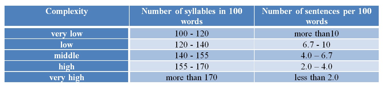
Figure 1 - Fry Readability Graph
1. The "Twitter" text, 100–200 characters long, contains information in a compressed form and is intended for quick viewing. This type is presented in news feeds, microblogs and hyperlinks.
2. The "two-thousand" text, 2000–2500 characters long, is the most readable, does not tire the reader, and can be read in a few minutes.
3. The "classic" text, over 5000 characters long, is the most complex option, requiring the reader's time and deep understanding of the material.
Ideally, the text of educational material should combine the properties of all three types of text. The educational text should have a meaningful title, a "Twitter" description (annotation). The main content should correspond to the "two-thousand" text model, and additional (in-depth, reference) information should be presented in a classic form.
There are different rules for creating “perfect” texts for e-courses. These rules can be applied to the text in any language read from the screen. They cover clarity, consistency and preciseness.
1. Subject and predicate should be placed at the beginning of the sentence.
2. Enumerations should be organized in bullet points.
3. Maximum length of the sentence should equal to 18 words.
4. Extra words should be cut out. The text should be written with the shortest words and shortest phrases possible. Here are some examples of necessary transformations: regarding = on; however = but; furthermore = also; consequently = so; necessary = needed. For example,
We needed to make a comparison of x and y = We needed to compare x and y.
There is a possibility that X will fail = X may fail.
Evaluating the component = Evaluating components
The user decides his/her settings = Users decide their settings
The activity of testing is a laborious process = Testing is laborious
No need for the following: = No need for
Various methods can be used to solve this problem such as = Methods:
5. Too many jargons, acronyms and abbreviations should be avoided. It is necessary to be cautious when using terminology.
6. Inconsistent language confuses readers. When writing online text, consistency of format, wording, and style should be maintained.
While making e-course teaching materials it should be kept in mind that they have to be customized to various learning styles — visual, auditory, verbal or kinesthetic . E-courses tend to be text-based forms of instruction and of course it’s rather difficult to make text information to cover all differences among students within a learning context that can appear in areas of general skills, aptitude, information processing, and application of information to new situations. But some attempts can prove to be effective. For example, the teaching material can combine text with charts, visual analogies and metaphors, colors or highlighters for visual learners; with audio files and sounds, rhyme and mnemonic devices for auditory learners; with the acronym or mnemonic devices, quizzes, intermittent tasks for summaries for verbal learners; with interactive simulations and gamified learning activities, flashcards, role-playing scenarios, and case studies for kinesthetic learners.
Learning styles customization can be accomplished through the use of various interactive communication techniques . Text of the lectures can be audio-streamed and synchronized with the applicable PowerPoint presentation, transcribed and posted. Content can also be presented in chat room discussion. Interactivity in e-courses can range from multiple choice quizzes, tests, simulations, animation videos, etc. incorporated into the textual material. These interactive interruptions help deepen the understanding of the text content, provide self-assessment or give instant feedback on the study progress.
When the text of the learning materials is written and revised there is time to think over its placement on the screen.
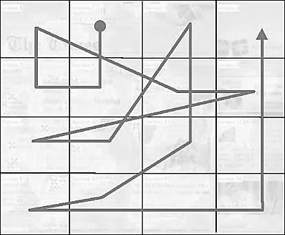
Figure 2 - Reader eye movement pattern
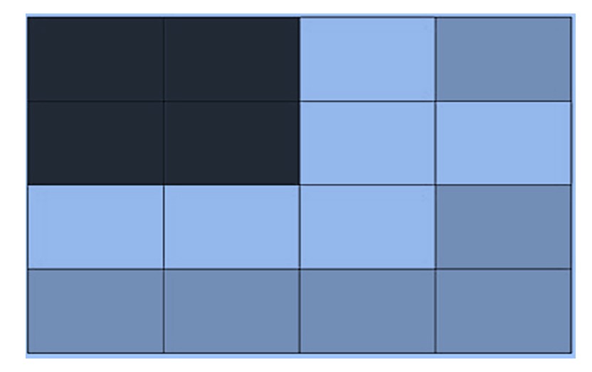
Figure 3 - Reader attention priority zones
As a result of such studies, it was also proven that many web page readers primarily paid attention to the dominant headings, and not to the images and graphics. The latter should serve only as an auxiliary tool, and don’t replace the educational text. The use of any graphic element should be logically justified in an e-course.
Graphics should also:
- be sufficiently detailed;
- contain only familiar objects or symbols;
- follow a uniform style;
- be placed in proximity to the required text;
- be signed.
Different contexts of educational material can be presented using different graphic means. Thus, facts representing unique, isolated information can be presented in the form of a table; concepts — groups of objects — in the form of diagrams and schemes interconnected with each other. A process, that is, a description of how something works, will look more visual in the form of animation or comics. It is more logical to present the description of procedures (a set of steps leading to a result) using diagrams with various arrows, and principles (guidelines for completing a specific task) using video.
Any imaging material in an e-course should meet the following requirements:
- concentration: the main ideas clearly expressed;
- brevity: descriptions minimized;
- coherence: graphics and text next to each other;
- perceptibility: quick perception by the eyes;
- structuring: a clear structure in the material and graphics;
- clarity: unambiguous perception of illustrative material.
Graphic objects that do not make sense, distract attention from the main content or can leave an incorrect (negative) impression should be excluded from the educational material.
When designing an e-course, you can use the results of psychological research on the influence of color on the cognitive abilities of learners as well . However, it is necessary to use color design only to help learners understand the information, and not just to make the screens look beautiful. Be consistent with color — use the same color for the same purpose throughout the course. Blue is one of the most common background colors. Research has shown that blue has the ability to slow down our breathing and heart rate. A dark blue background with light text is great for traditional courses. Light blue, which has become more common in recent years, is a good choice for educational text that is studied in a quiet environment with the lights on and promotes potential interaction between the learner and the teacher. Green has a similar effect — it is intended for information that is subject to discussion. Red should be handled with caution. Red is one of the most influential colors in the software palette, aimed at attracting attention, but it can also have negative associations. Purple is often associated with superiority, representing wisdom and spirituality. Yellow can evoke feelings of frustration and anger. Although it is considered a cheerful color, people are more likely to lose their temper in yellow rooms, and children tend to cry more. Because yellow is the most noticeable color, it is also the most attention-grabbing. Yellow can be used in small amounts to draw attention to key words or highlights, for example, but not as a background. Often overlooked, black is a background color with useful psychological connotations. Black is associated with completion and also works well as a transition color, so using black creates the impression of a beginning, something new. White is also a calm and neutral color for creating training materials. It is great for conveying new information, allowing the learner to focus solely on the material. It is clean, open and inviting, and can create a sense of space or add emphasis. But it can also be perceived as too plain and harsh on the eye. Gray, according to psychologists, is often perceived as a negative color. It can be the color of avoidance and rejection, since it is neither black nor white. Gray (or “silver”) is a softer background than the harsh default color of white, and works well for almost all training courses. It is worth remembering that the human eye perceives dark colors as “heavier” than light ones, so graphic elements arranged from darkest to lightest are easiest for the eyes to scan. In diagrams, it is best to arrange colors from dark to light.
Website designers know that a website's background and font color can have a significant impact on whether a user stays on the site or not. This means that the color characteristics of the screen can also affect how effectively the user views the screen in a training course. You just need to remember to have contrast between the background and the font, and keep in mind that many people have trouble distinguishing between red and green (as well as brown/green, blue/black, and blue/purple), so you shouldn't use these colors in combination. When working with text in training material, you need to choose font types and sizes carefully as well. Although there is a huge selection of fonts, it is recommended to use standard fonts that are common to all operating systems. There are several types of fonts - serif fonts and sans serif fonts. Serif fonts are fonts with little tails attached to each letter. They have a classic look but researches show that serif fonts are the easiest to read in printed versions when the readers follow the linear principle of text organization and not on the screen as the lines become overloaded providing some tension. The most popular serif font is Times New Roman. Sans serif fonts are fonts that look more like “stick letters”. Examples of sans serif fonts include Arial, Tahoma, and Verdana. A sans serif font is easier to read from the screen as it has a clean and simple design, so it’s best used for e-courses. When writing a course, avoid using all-caps words to emphasize or draw attention, even for headings. All caps are perceived as a SHOUTing, and information presented this way is harder to understand. It’s a good idea to use different fonts for headings and the bullet points. This will make text screens a little more interesting. Script Type fonts should be avoided, as well as italics. They try to imitate handwriting, but they are quite difficult to read, and the learner will spend too much time trying to read the words and won’t be able to focus on the information.
3. Conclusion
The article highlighted some aspects for developing effective learning materials used in online educational process. The most drastic point to keep in mind when making an e-course is the difference between online and offline teaching materials. It is the content that should be the same, but not the form. The text itself should be revised, shortened and simplified. It should be placed on the screen, providing taking into account the features of human eye perception of onscreen information.