История цвета: от наскальных рисунков до RGB
История цвета: от наскальных рисунков до RGB
Аннотация
Особенности цветовосприятия и воздействие тех или иных оттенков на психологию человека исследуются уже не одно столетие. Эти исследования позволяют нам понять психологию цветовосприятия, а также научиться использовать цвет для создания нужного ощущения или настроения у зрителей. На самом деле в природе не существует цветов, они есть только в нашем восприятии. Цвет – это свет, который имеет определенную длину волны и отражается от поверхности, воздействуя на рецепторы сетчатки глаза. То есть цвет – не объективное понятие, а ощущение, которое возникает в мозгу, когда человек видит что-либо. Цвет как физическое явление существовал всегда, но только после появления человека, который смог его воспринять и осознать, он превратился в важную часть картины мира.
1. Introduction
Perception of color in the minds of ancient people
Ancient people perceived colors inextricably with the accompanying phenomena or forces of nature. Since humanity did not yet know how to produce artificial dyes, there was simply no need to designate colors in the usual sense for us. Moreover, people's daily lives were too focused on survival to think in abstract terms.
Thus, the first names of colors were primarily associated with natural objects. For ancient man, the phrases “blue sea” or “green grass” would have been meaningless. It would sound as strange to them as if we said “sea sea” or “grass grass” .
The basic color palette of ancient people included only two color concepts: white and black. Moreover, it was not so much the colors as the state of the objects. White color in all cultures is associated with light, purity, goodness, order and other positive phenomena. White is always light and day, the time when a person is awake, active and clearly perceives the world around him. It is also the color of purification and dedication to God. It is no coincidence that ritual clothing in many cultures was white. By the way, the modern symbolism of this color includes such concepts as “white roses” – a symbol of innocence and purity of thoughts, or “a bright person” – a positive character from whom you should not expect anything bad.
In contrast to white, black in all cultures symbolized darkness, chaos, dirt, death, and other negativity. People associate the color black with night – a time when practically nothing is visible, and the world around is full of dangers. It is in the dark that enemies can sneak up on a person or attack wild animals. The association of black with death is also caused by the parallel that ancient people drew between death and sleep. When we close our eyes, the world disappears and plunges into darkness – often this state frightened people. For example, the ancient Greeks believed that during sleep the soul leaves the body, and if a person is not woken up in time, it may not find its way back . Thus, the color black symbolizes fear, the abyss and everything else that frightened people. For example, in our time, you can hear such expressions as “black soul” or “rainy day”.
The third base color was red. This is the first color that ancient people began to consciously distinguish from others. Fire was red, as well as blood – in all cultures it was perceived as an integral part of a living organism, without which it is impossible to live. It is worth noting that the concept “red” originally meant a wider palette of colors than might be imagined by modern people. Primitive people did not yet have the need to distinguish between shades. There were no dyes yet, and there was no energy or time to think about color as an abstract concept either, so red could mean orange, ocher and even yellow. That is, all shades that were, to one degree or another, associated with warmth, life and energy. By the way, red is also the most militant color. Red was the war paint of the warriors; the first protective symbols were drawn in the same color.
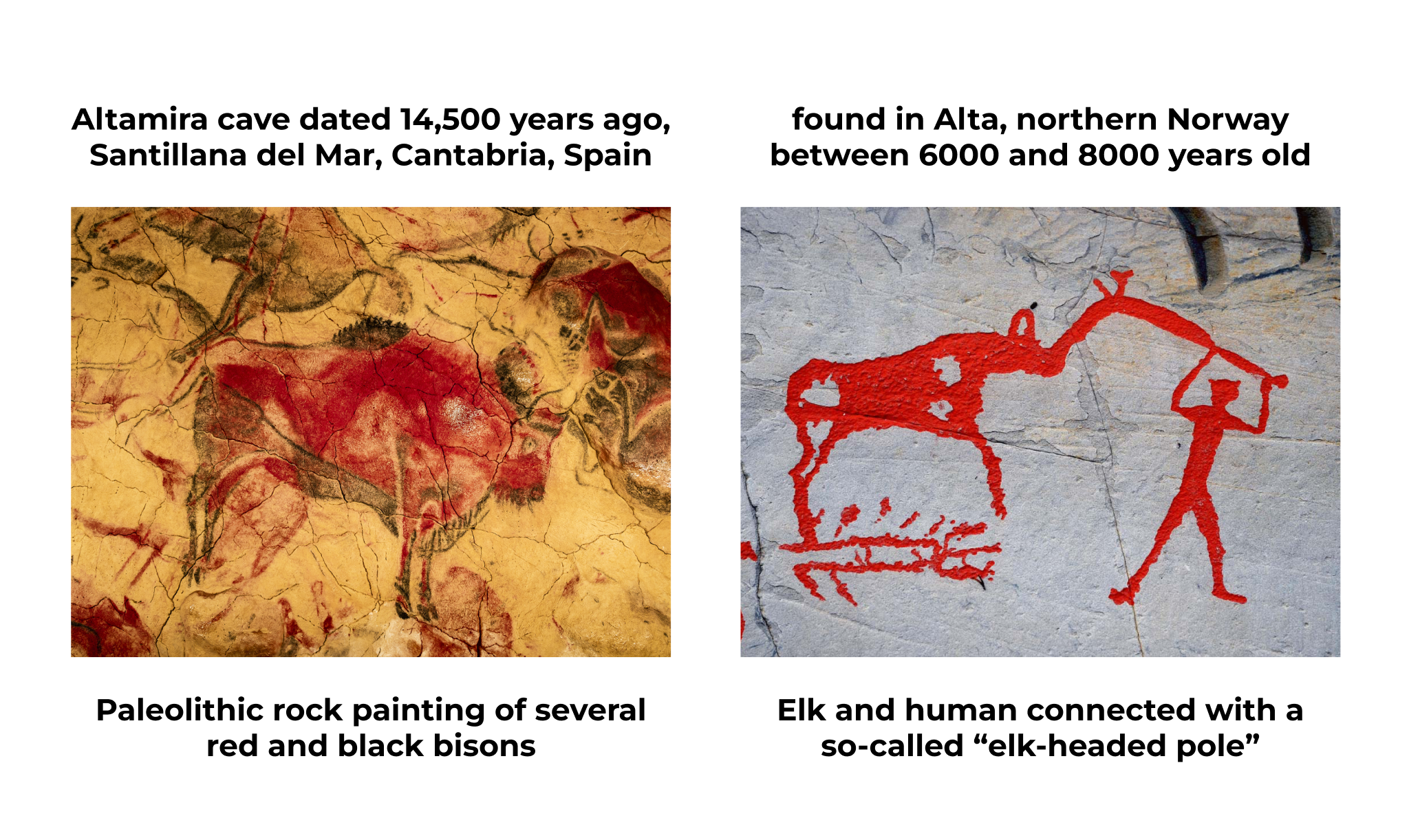
Figure 1 - Ancient examples of using Red color
Both of these colors stood for life, nature, sky and sea, youth and rebirth. The blue sky gave peace, the water allowed you to quench your thirst, and the appearance of young greenery indicated that spring had finally arrived. After the transition to a sedentary lifestyle and the beginning of the emergence of the first social structures, people received the time and opportunity to consider colors precisely as shades, and not as phenomena. Since then, color perception began to become more complex, decorative and applied arts began to develop, and different peoples began to have separate words denoting colors rather than phenomena.
Interestingly, the first color to appear on our planet was pink. In 2018, while mining black shale in ancient rocks of the Sahara, Australian researchers discovered pink molecules . As it turned out, the age of the found microorganisms exceeds a billion years, and they appeared on Earth even before the birth of the first living organisms and even plants.
After carefully examining the molecules, scientists found that they represent residual material from ancient organisms that lived in proto-oceans. About 650 million years ago, the first algae appeared on Earth, which had colors already familiar to us and could evolve into more complex organisms. Thus, pink microorganisms became extinct long before the first humans appeared. If they had become the basic species, then perhaps our color perception would have been completely different.
2. Individual and national characteristics of color perception
The associations and psychological effects of flowers on modern people depend on many factors. Starting from archaic stereotypes and ending with the features of the natural environment, cultural code and personal experience. For us, like for our distant ancestors, it is natural to perceive colors in connection with phenomena or objects of nature. For example, anyone on Earth will experience the colors blue and green as calming because these are the colors most often found in the sky, sea, and natural vegetation.
The association “light is above and dark is below” is also part of the collective cultural experience. The fact that the sky is in most cases lighter than the earth is known to all people, regardless of their age and nationality. The sky or grass of red color will be perceived as unnatural and alarming, as it contradicts the basic concepts of a person.
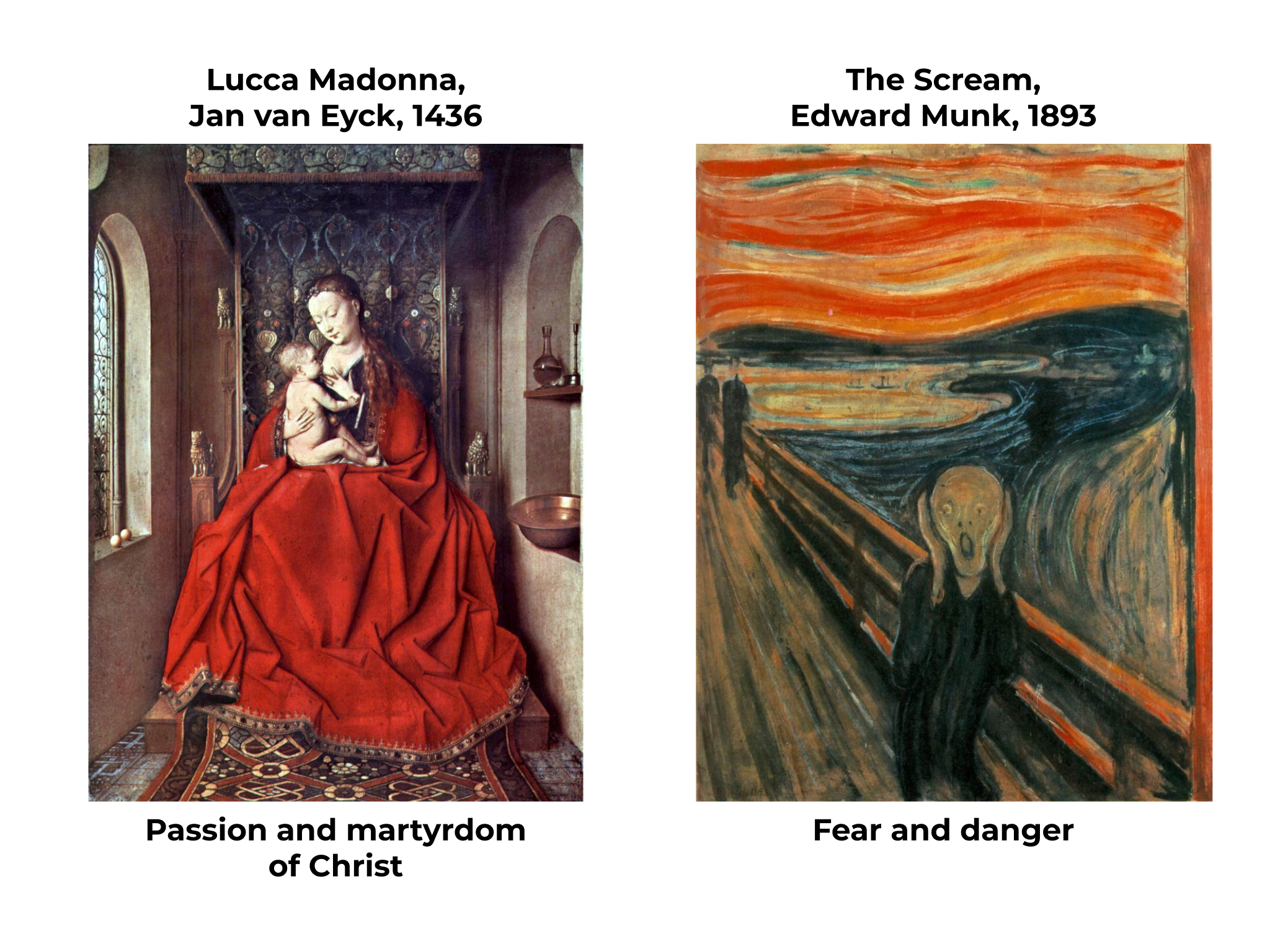
Figure 2 - Usage of Red color in different ages with different aim and approach
The situation in the country or in the world can also affect color perception. For example, during the pandemic, people were afraid of getting sick, so instead of the usual dark colors, many chose lighter colors for everyday clothes. These are the shades that are associated with purity and sterility. But still, in many cultures there are slight differences in the psychological perception of colors, which are associated primarily with the cultural code. So, for Europeans the mourning color is black, and for the Japanese and some other eastern peoples it is white.
General attitudes towards color perception are ingrained in people's minds through fairy tales, traditions and color codes of their culture, but individual color perception will depend on the experience of a particular individual. This is why color tests are so popular in psychology. The relationship between preferred colors and shades and a person’s character and mood was actively studied at the end of the last century . And the Luscher color test was used in psychology even earlier – starting in the fifties. Psychotherapist Max Luscher argued that the difference between universal patterns of color perception and a person’s subjective perception makes it possible to determine his emotional state . Modern psychology also actively uses the color relationship test, which allows us to determine the conscious and unconscious aspects of an individual’s thinking .
3. Color in Ancient India
The ancient Indians perceived the sacred triad (black-white-red) in inextricable connection with the three gunas (properties) of the material world. White – the color of the sky and the primary waters from which existence arose – denoted life, purity and a state of serenity. He was associated with the guna Sattva, which symbolizes wisdom, spirituality, harmony and stability.
Red, the color of fire, was a symbol of activity, action and change. His guna, Rajas, was associated with passions and desires that forced a person to change this world and became the reason for the accumulation of karma. Black – the color of earth and darkness – symbolized passivity, the inhibited and apathetic state of man. He was associated with the guna Tamas, which symbolizes ignorance, chaos and destruction.
Blue was perceived by Indians as the color of supreme wisdom and conscious calm. It was associated with sky and sea, therefore it was a symbol of divine infinity. The gods Krishna and Vishnu are often depicted with blue skin, which emphasizes their serenity, wisdom and infinity. Ancient Indian philosophers also believed that it is this shade that has the “third eye,” which allows you to see the invisible and know yourself and the world.
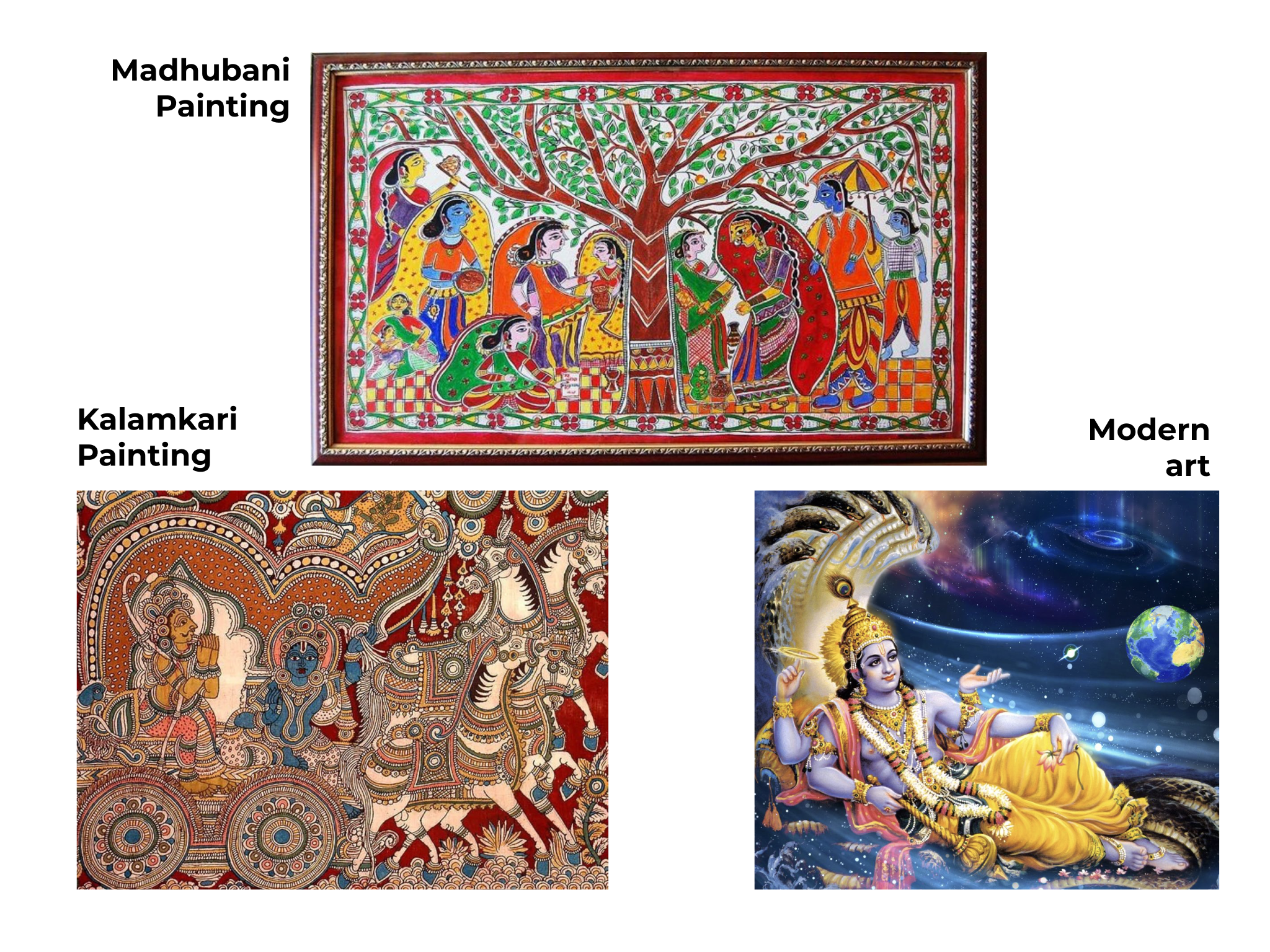
Figure 3 - Gods and wisdom are always shown in blue skin color in Indian Art
4. The meaning of color in Chinese philosophy
According to Chinese philosophy, the whole world consists of five primary elements, which correspond to certain colors and elements. The fire element corresponds to the color red, which is associated with vitality, strength, joy, luck and wealth. That is why this color is considered the color of joy and celebration. Festive outfits and accessories, auspicious hieroglyphs and gift envelopes for money are usually red. The time of year corresponding to this color is summer.
The element of water is indicated in black. This shade symbolizes wisdom, flexibility and endless possibilities (feminine Yin energy). It is interesting that this particular “Yin” color is a symbol of severity and solemnity in China. Black color is associated with winter – a dark and cold time of day. In contrast to black, white in China is considered a manifestation of masculine Yang energy. Its primary element is metal, and its key characteristics are purity, perfection, strength and determination. Because polished metal has the ability to reflect light, white symbolizes clarity and order. The season of this primary element is autumn, the time when the world becomes duller and the air more transparent. Unlike Western cultures, in China white is the color of mourning.
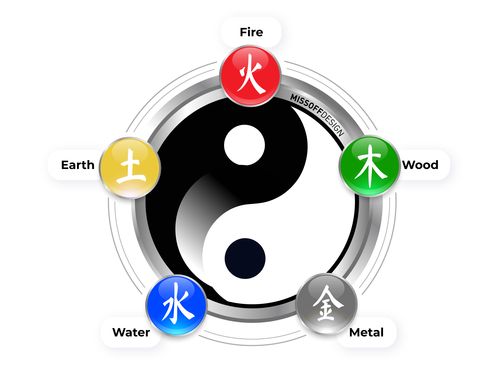
Figure 4 - Five colors and five primary elements in Chinese philosophy Wu Xing
The element of wood is associated with the color green. As in many other cultures, it is a symbol of life, growth, development and flexibility. This primary element corresponds to spring – the period of the rebirth of nature. Also, the color green in Chinese culture symbolizes healing and naturalness. For example, organic vegetables will be called green, regardless of their actual color. Interestingly, the color green can also have a negative connotation in China. By giving a Chinese man a green headdress, you will hint to him that his wife is unfaithful. The thing is that in ancient times, the husbands of courtesans wore scarves of this particular color on their heads .
5. Color symbols in Ancient Russia
The basic colors of the ancient Slavs are considered to be white, blue and red. The latter was one of the most revered flowers, which was widely used both in Ancient Rus' and at a later time. It was associated with vitality, beauty, health and courage. The banners of the princely squads, protective amulets, and festive clothes were red. In Orthodoxy, the color red symbolizes the atoning sacrifice of Christ, and the red Easter egg symbolizes the divine resurrection. The word “red” still denotes everything that is best, important or rare (for example, “red maiden”, “Red Book” or “Red Square”).
White color, in addition to basic universal meanings, had one more, unique meaning in Rus'. He was associated with freedom, space and independence. As an example, it is worth recalling the expression “to the whole world.” Blue and its shades were also very loved by the Russian people. It is worth remembering the famous Gzhel ceramics or folk patterns. The blue color meant the infinity of the sky and was a symbol of paradise and heaven. Therefore, it was used in icon painting to depict the robes of saints and angels, and was also a symbol of the Mother of God, in whom the earthly and heavenly were united. The blue of the sky and water surface are also the background and personification of Rus' and Russia in the works of many poets and artists.
6. The meaning of the colors of European coats of arms and flags
In European heraldry, the symbolism of color was given special importance. The background and shades of the elements of coats of arms and flags could tell a lot about their owners. Even ordinary people who could not read subconsciously read the meaning of the symbolism, since it corresponded to the cultural code familiar to them from childhood. For example, the color red symbolized courage, bravery and determination. Noble azure blue was a symbol of beauty and communicated the greatness of the owners of the coat of arms. Green was associated with abundance, wealth and hope, while purple was associated with power and dignity. Backgrounds and elements of black communicated sadness and prudence, while white or silver conveyed purity and innocence, and yellow or gold were associated with wealth and generosity .
7. Color studies and theories
People began to be interested in the study of color ever since the first sciences began to emerge, but the essence of this phenomenon remained unclear for a long time. The nature and meaning of color have been studied by scientists of various specializations. The goals of these studies were also different, so for a long time people were not able to fully understand the nature of color and combine the results obtained into a single structure.
Philosophers of Ancient Greece, India and China looked for the relationship between colors and natural phenomena, and also tried to compare the sacred triad and other basic shades with the cosmogonic picture of the world. Artists, tailors, architects and craftsmen studied color combinations in search of the most harmonious and pleasing to the eye options. In fact, it was these studies that formed the basis of modern color psychology. Physicists, opticians, biologists and other scientists involved in the exact sciences were interested in the nature of color and the mechanisms of perception of shades by the human eye.
One of the oldest surviving studies of the nature of color is the teaching of Aristotle, who believed that all shades come from two basic ones – black and white. The scientist identified four primary elements in the structure of the world. According to his theory, light (aka fire) was white and darkness (earth) was black. The remaining two primary elements: air and water, do not have a specific color and can take on different shades. Aristotle considered all other colors to be the result of mixing the basic ones . The scientist of the late Hellenic period, Claudius Ptolemy, studied the nature of color as a physical phenomenon, who studied the reflection and refraction of color.
It was these scientific works that became the foundation for the color theory of Isaac Newton, who was the first to consider the refraction of solar color through a prism and decompose it into spectral bands. Newton identified seven colors that became the basic colors for artists and researchers. Subsequently, Johann Wolfgang von Goethe decided to clarify the experiment and identified another color in the spectrum resulting from refraction – purple. Based on the color circles of Goethe and Newton, Johannes Itten, an artist and color researcher from Switzerland, compiled a color wheel consisting of twelve parts. In the center there are three basic colors, and on the edges of the central triangle - the result of their mixing. The outer circle includes the shades that are obtained by mixing primary and secondary colors.
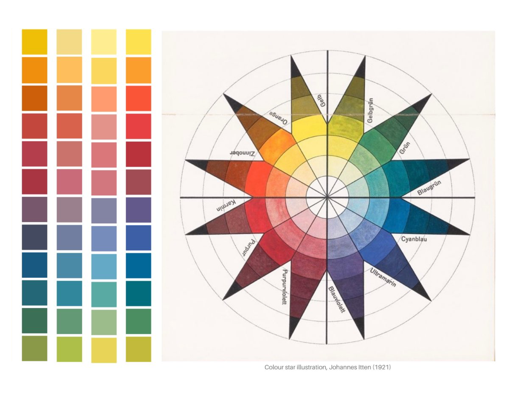
Figure 5 - Johannsen Itten's classic color wheel
Subsequently, the Architect Le Corbusier developed several types of color schemes, each of which has a different effect on the viewer's perception. According to his theory, the combination of beige, black and ultramarine is stable and sustainable. Red-orange combined with lemon yellow, green and cobalt blue create a feeling of mobility and dynamism. The architect called the combination of dark red, emerald and various lacquer shades decorative, as it is optimal for finishing and creating accents.
Although many great artists, including Leonardo da Vinci, encouraged breaking rules and acting intuitively, the creation of color patterns has helped and continues to help designers and other creative people realize their visions to the fullest. Industrial developments have led people to try to classify colors according to numbers or other designations. This made it possible to tie a variety of shades to technical standards for use in production. Several classification options have been developed, but in the modern world the basic one is the Pantone system, which is widely used in a variety of areas of industry and design.
8. Digital RGB, CMYK and Pantone color models
Although modern digital color models at first glance do not look like classic color wheels, in fact they do not contradict the basic systems, but complement them. Both scientists managed to notice and study two opposing aspects of the nature of color. Newton argued that the colors of the spectrum he identified could be mixed to obtain any shades, including white, which is the sum of all the others. This method was called subtractive. Goethe's theory stated that any shades, including black, could be obtained from the colors of his circle. But to do this, you need to subtract one or another shade from the base white color. If we remove all the shades, we get black. This method is called additive.
The new RGB and CMYK color models are based on these concepts. The CMYK model consists of four colors: C – Cyan (blue), M – Magenta (magenta), Y – Yellow (yellow) and K – Key or Black (black). It is used in color printers and printing. The system is based on the fact that from a combination of small dots of the above four basic colors on a print, you can get almost any shade. Since this system involves the overlay of different colors, it is essentially subtractive.
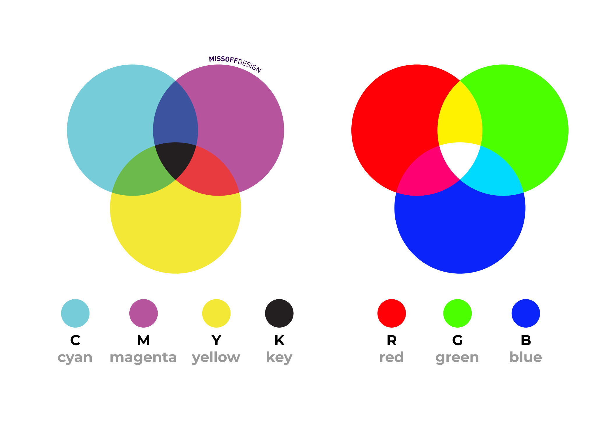
Figure 6 - RGB and CMYK color models
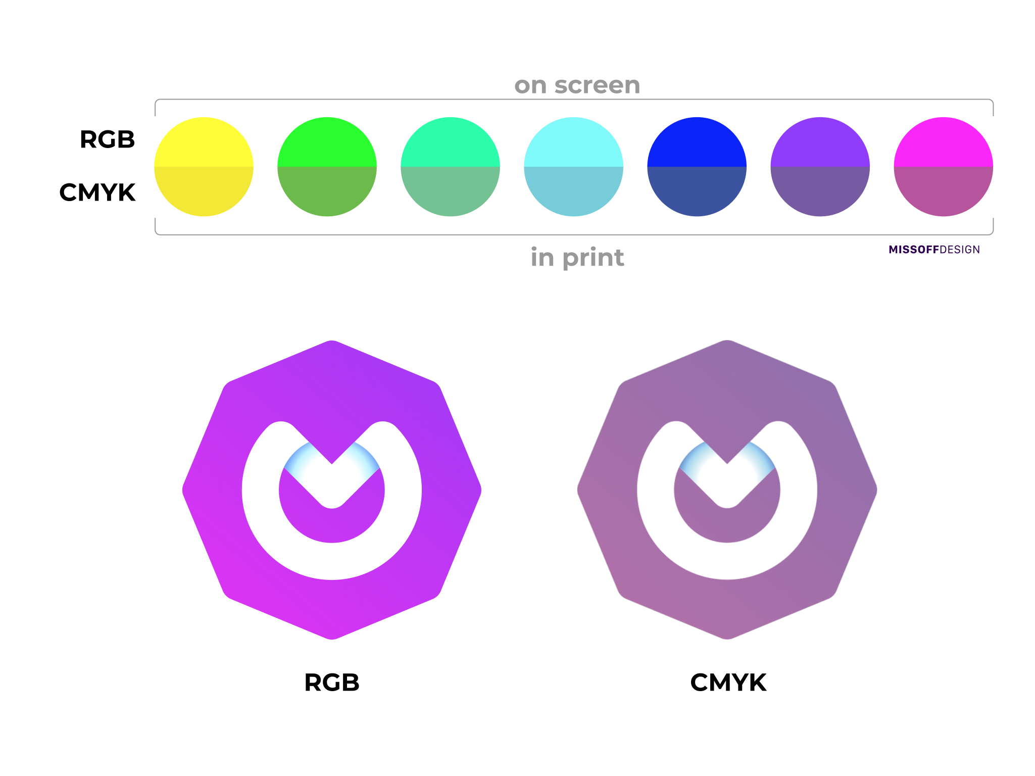
Figure 7 - Difference or RBG and CMYK schemes on screens and in printing
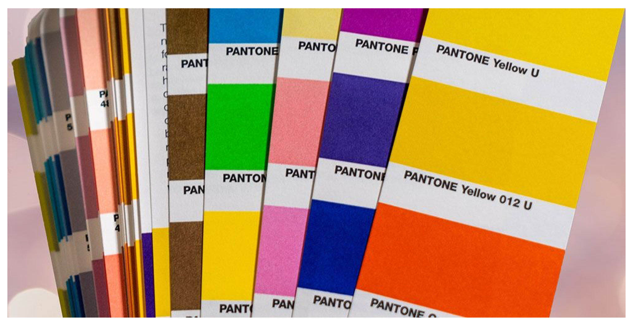
Figure 8 - Pantone palette
9. Conclusion
Modern work with color is based on all basic theories. Knowledge of the sacred triad, heraldry and color psychology allows artists and designers to calculate in advance what psychological and emotional impact their creations will have on human emotions and behavior. Newton's, Goethe's and Itten's circles allow creators to find color combinations that will perfectly match their design. Digital models and palettes make it possible to translate developed projects into reality as accurately as possible. But the study of the nature and meaning of color does not end there. Modern scientists continue their work, striving for the most accurate color reproduction and a deeper understanding of the meaning of color.
